How responsible design can help prevent exclusion
Following the European Accessibility Act, many companies and organisations have started building more inclusive digital services. The new directive requires public organisations to make their services accessible to people with impairments. To achieve this goal, web standards such as The Web Content Accessibility Guidelines (WCAG) help guide developers, designers and content creators in their efforts.
However, the topic of disability is not limited only to people with physical or cognitive impairments. On the contrary, according to the World Health Organisation (WHO), disability is a “universal human experience” – everyone can experience disability in certain situations or times in their life. Society is based on a multitude of individuals with varying abilities. Therefore, society as a whole – from the built environment to our tools, products, and services – has to account for the variability of the human body. Consequently, when building tomorrow’s products and services, designers need to consider the diversity of society and prevent exclusion caused by design.
Through this project, I wanted to show that people with impairments can offer invaluable insights to innovate our digital landscape. By embracing their restriction, we can build more robust products, and thus, reduce annoyance for people who experience situational disabilities and exclusion for people with bodily impairments.
Project
For my master thesis I conducted five interviews with people with visual impairments. The interviews aimed to understand the factors influencing their personal experience of accessibility, how technology can mitigate disability and what they perceive as a positive user experience.
Positive user experiences.
If design creates disability, how can designers and other project stakeholders prevent this exclusion while improving the user experience for everyone?
First of all, it is important to note that universal accessibility is, most likely, unachievable. We might never see a website that is equally easy for all internet users to access. Instead, designers should discern the case-specific disabling factors for each project. This can be achieved by asking questions: Does a product rely on visual content? Will it require people to read long texts? Does it have audio-based content? Is it going to feature motion graphics or moving images? Based on these answers, designers can then discern the people who are most likely to be excluded from using the service.
In my thesis case, I focused on ways to substitute visual content to improve accessibility for people with visual impairments. That definition already includes a wide range of people, starting from people with colorblindness or low vision, to progressive loss of sight, or blindness. Nevertheless, by speaking with five people in various stages of visual impairment, I discerned nine design-related challenges to improve their browsing experience, accompanied with positive example cases from their daily internet usage:
-
Consistent use of headlines
Screen reader users often access the content of a page through its headings. Thus, consistent use of heading tags, starting from H1, will help screen reader users quickly find the content they are looking for without having to listen to all elements on a website.
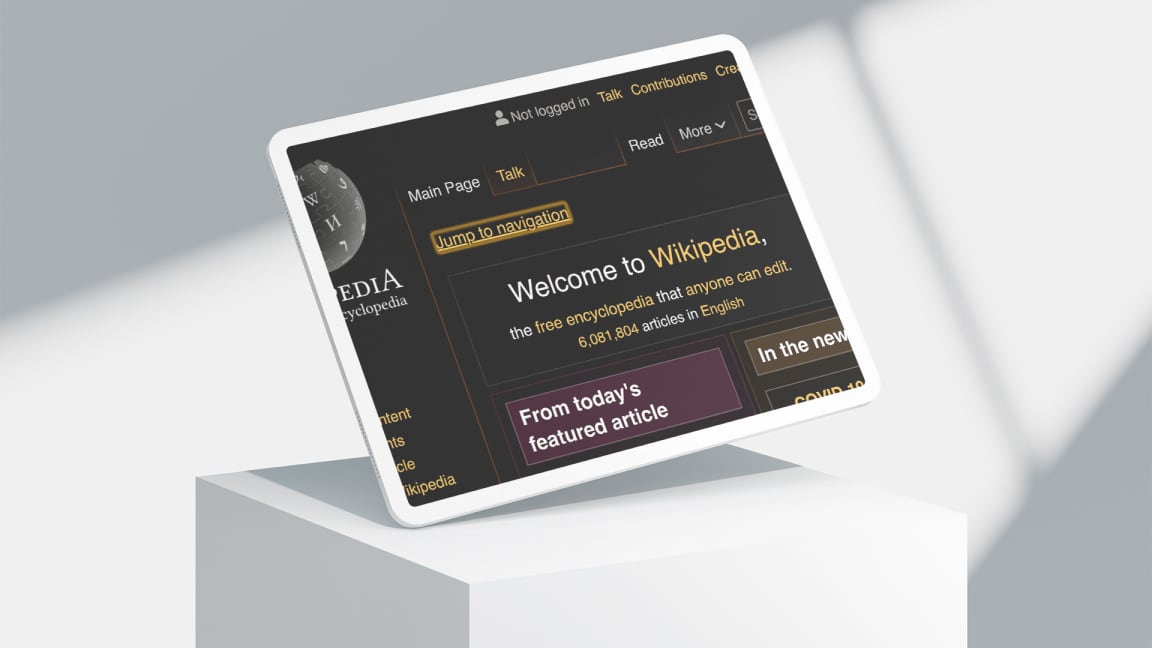
Good example: Wikipedia -
Consistent layout on all pages and subpages
Finding your bearings on a website is far more difficult without the aid of visual cues. If the structure of the website changes on subsequent pages, users will have to re-establish their orientation – which is even more difficult for people with visual impairments.
Good example: Wikipedia -
Differentiation between content and function
When the functional parts of a website – for example, navigational elements – are separated from the content, people using screen readers can skip ahead to the content faster, and people using screen magnification can focus their view on the content section.
Good example mentioned in the interviews: Verkkokauppa.com or Facebook -
Predictable behaviour
Unexpected transitions on a website are liable to cause confusion for people with visual impairments. Such transitions include menus that open by merely hovering over an icon with the cursor, or predicting search results before the user has finished typing. Enabling people to confirm their action – for example, to remove an item from a shopping cart – will help users stay in control of their interaction with the website.
Good example mentioned in the interviews: Urjalan makeistukku. An international example: Topshop -
Placing elements in intuitive locations
Following common design patterns for placing elements on a website helps people with visual impairments find items, such as the search functionality or language settings, based on their previous experience.
Good example mentioned in the interviews: The iOS back button is always located in the top left corner. -
Layout Jumps
Navigating back to a page after browsing a subpage should lead the user to the same position where they previously left off. When a site changes its scroll position after confirming a dialog option, for example, users will need to reorient themselves to find their previous location. Especially for people with visual impairments, this “jumping” behaviour leads to confusion and frustration.
-
Amount of information on a site
Partially sighted people cannot skim texts. Consequently, reading will take them more time and effort than it does for sighted users. A large number of unnecessarily elaborate titles is particularly tiring, especially when the length of the title is irrelevant to understanding its content.
-
Search
To prevent having to listen to the entire content of a website, people with visual impairments often rely on its search functionality. Additional filters to refine and sort search results would give them faster access to the requested content.
Good example mentioned in the interviews: Zalando
Design process
The entire product team is responsible for building an inclusive product, but it is the responsibility of designers specifically to consider the variability of the users. While it is impossible to design for everyone, preventing exclusion for the people most likely to be affected by it prevents design exclusion and, by extension, yields a more robust and versatile product.
In most design processes, designers focus on an average user derived from the majority of people anticipated to use a product. As a result, designers tend to get surprised when they see a website used at 200% magnification, using inverted colours, or spoken through a screen reader. In order to build inclusive products and services, we have to unlearn the ableist view, and forget the notion of the able-bodied user as the average or “normal” audience of any product or service. Designers should not assume digital content to be consumed in one specific way or appearance. Instead, they should focus on maintaining the same richness of information when using assistive technology.
To help designers empathise with people with impairments and better understand their browsing experience, one interviewee suggested a mouseless day. As many people with impairments – such as those with severe visual impairments – cannot use a mouse, a website has to be fully functional through the keyboard. By only using a keyboard to browse the internet, designers learn the impact of the tedious limitations many websites impose on people with impairments.
In conclusion, interaction with people with disabilities should not be encouraged merely to validate the usability of a service, but to drive innovation. By substituting the visual world through their hearing, people with visual impairments are experts in a field that technological advancements are only beginning to discover. Therefore, people with disabilities are experts by experience, and invaluable collaborators for building innovative products and services.